Mojo Coworking
In-House Brand Management, Print & Digital Asset Development, Newsletter Redesign, Environmental Design
Mojo in Motion
At Mojo Coworking, I led a full brand refresh and realignment, updating outdated materials to match original brand guidelines while evolving the visual identity with new design elements. I worked across administration, marketing, and design, developing print materials, social media assets, internal signage, member communications, newsletters, merchandise, and environmental graphics—all crafted to strengthen brand recognition both digitally and onsite.
My role focused on maintaining brand consistency while introducing subtle creative expansions that added dimension and personality to the brand. One of the most impactful projects was the creation of the Mojo Girl mural—a bold, landmark visual that became synonymous with the space itself, turning Mojo into a true Asheville staple and solidifying its identity as more than just a coworking space.
.png)

.png)
OVERVIEW
Mojo Coworking is Asheville’s original coworking space, established over a decade ago. As Brand and Operations Manager, I undertook a full brand cohesion and modernization project from a design and marketing perspective, ensuring every public-facing and internal asset aligned with the company’s original brand guidelines—while respectfully evolving the visual identity to better fit contemporary standards.
(For a detailed overview of operational systems, sales processes, and facilities management contributions, see the portfolio slide deck linked below.)
INITIAL BRAND AUDIT & REALIGNMENT
When I began, Mojo’s brand assets—newsletters, onboarding materials, signage, and sales resources—were heavily fragmented and often off-brand, relying on outdated Canva templates with incorrect fonts and inconsistent visual structures. My first focus was a full brand audit and realignment, which included:
Updating all digital and print materials to match original brand fonts, colors, and standards
Rebuilding onboarding handbooks, community guides, and workflow binders to reflect consistent branding
Refreshing sales signage, street sandwich boards, availability posters, and internal directional signage
DIGITAL MARKETING REVAMP
The email newsletter was also completely restructured:
Migrated from an outdated MailChimp layout to a more dynamic platform (Exodus)
Designed a fully branded newsletter template using correct logos, brand colors, and fonts
Integrated consistent, recognizable visuals into ongoing member communications and marketing blasts to strengthen brand recognition
ENVIRONMENTAL & PRODUCT DESIGN
Expanding beyond internal documents, I also designed and implemented:
A large custom window mural for street-facing brand visibility
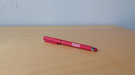
Branded merchandise, including t-shirts, mugs, cups, and pens
Event signage templates and on-site promotional materials
BRAND EVOLUTION
While staying true to Mojo’s original identity, I also introduced a subtle visual expansion:
Developed and integrated hexagonal, interwoven design elements
Used soft layering techniques to balance the brand’s bold red and blue color palette and heavy typefaces, adding visual depth without sacrificing brand integrity
Incorporated these motifs into newsletters, murals, signage, and upcoming merchandise cycles
REFLECTION
This work gave me deep, hands-on experience managing an established in-house brand—balancing the need for consistency with opportunities for strategic, evolutionary updates. I also gained practical experience in preparing files for both digital and physical production (garments, signage, print materials) while navigating real-world operational timelines and facility needs.
KEY CONTRIBUTIONS:
Full brand audit, redesign, and realignment of all materials
Newsletter platform migration and brand-standard redesign
Creation of internal/external signage, branded merchandise, and mural designs
Subtle brand evolution through new illustrative elements
Production-ready file preparation for both digital and physical outputs


